Base
AI Chat Practical Guide
Welcome to Teable AI, your dedicated 24/7 data analyst.
Forget complex formulas, tedious filters, and time-consuming reports. Here, a simple conversation is all that separates you from your data. This guide moves beyond a simple “feature list” to focus on “problem-solving.” We’ll share practical strategies and techniques to help you transform raw data into actionable insights that drive business growth.
Let’s start with a real-world scenario:
 Imagine you’re drafting a weekly report. The following conversational flow can help you build a data-backed narrative with compelling visuals:
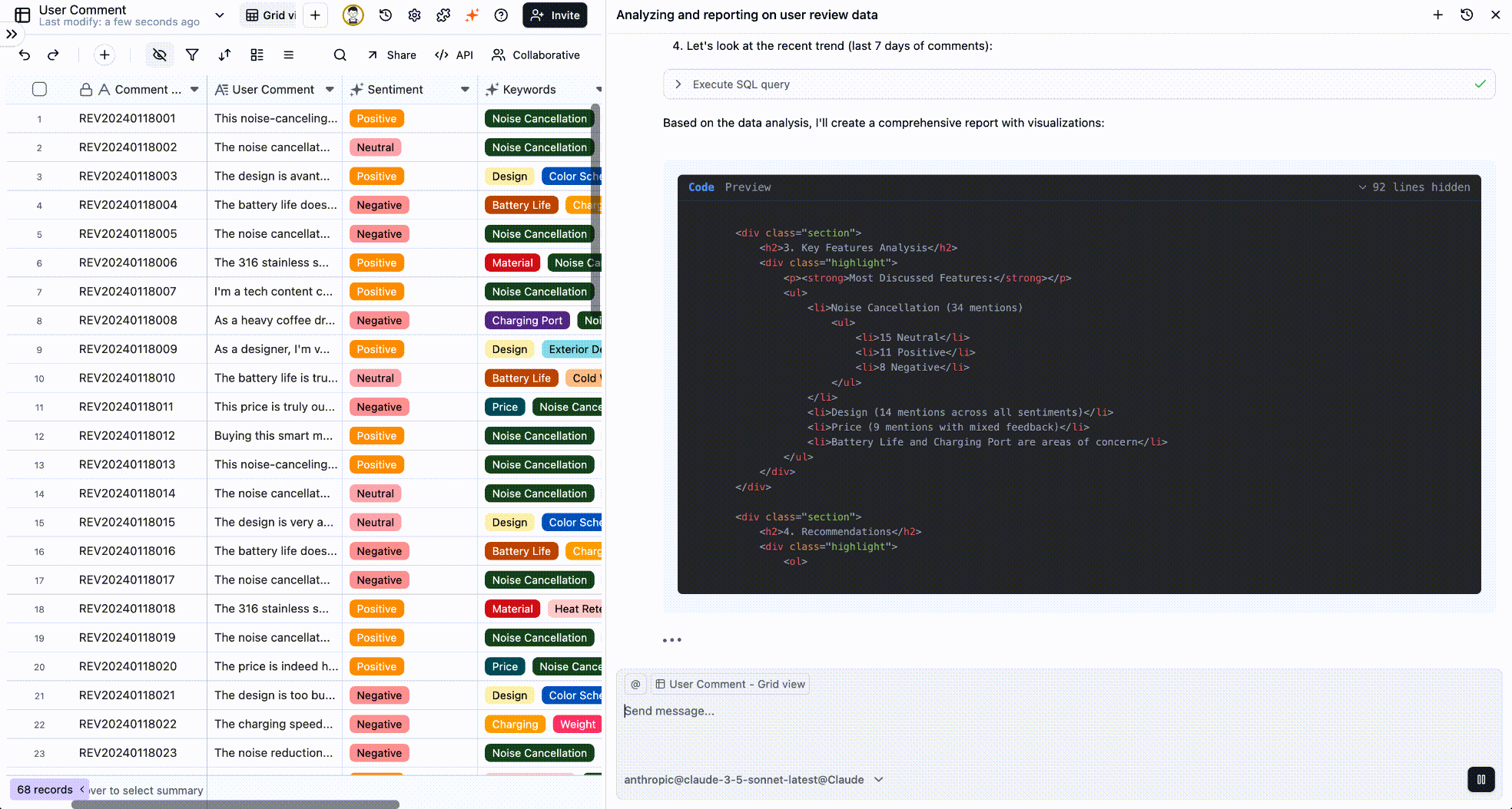
You: “What are the main themes in our negative feedback? List the top three.” AI: “Based on the data, the most common negative feedback points are: 1. Noise cancellation (especially for voices); 2. Battery life; 3. The casing material is prone to fingerprints.”This simple exchange could set the direction for your next product iteration. That’s our goal: to be efficient, precise, and actionable.
Part 1: The Art of the Ask—Turning Business Questions into AI Prompts
The core of talking to an AI is translating your business questions into clear prompts it can understand and execute. This isn’t just about asking—it’s about strategic information retrieval.Strategy 1: From “Data Pulling” to “Daily Health Checks”
Don’t just turn to AI in a crisis. Make it your go-to tool for routine business health checks to quickly monitor key metrics.Open multiple spreadsheets, manually calculate key metrics, then copy-paste into a report or Slack. It’s slow and error-prone.
Pro Tip: Build these questions into your daily routine. Spend two minutes each morning querying your key metrics with AI—just like checking the weather—so you always have a pulse on your business’s health.
Strategy 2: From “Casting a Wide Net” to “Surgical Strikes”
Filtering is about focus. When you have a specific goal or hypothesis, use precise conditions to test it. Scenario: Planning a marketing campaign for high-value customers.- Define “High-Value”:
“List all customers who have spent over ¥10,000 in the last year.” - Add a Regional Filter:
“From that list, filter for customers in the East China region.” - Retrieve Contact Info:
“Now, list their names and phone numbers.”
Best Practice: Think like you’re peeling an onion. Start with a broad query to define your initial scope, then progressively add qualifiers to zero in on your target audience. This is far more effective than trying to build a single, overly complex query from the start.
Strategy 3: From “Isolated Data Points” to “Uncovering the Story”
A single data point rarely tells you much. But when you connect multiple points, you start to see trends, patterns, and the story behind the numbers. Scenario: A quarterly review to assess if your growth strategy is working.Strategic Mindset: Use comparisons to evaluate past performance (Did our strategy work?) and trends to forecast the future (Is our growth sustainable?). Always ask yourself, “So what?”. For instance, if you see growth slowing, your immediate next question should be:
“Analyze the months where growth slowed. Which product line’s sales decline was the primary driver?”A Quick Guide to Better Prompts: Talk to It Like a Human Analyst
-
Be Specific:
Instead of
“How are sales?”, ask“What were our sales in the South China region last month?”. - Speak the Table’s Language: If your column is named “Order_Value,” use “Order_Value” not “Revenue.” This helps the AI find the data faster.
- One Question at a Time: This makes it easier to follow up and drill down into the details.
-
Use Follow-ups:
The AI remembers your conversation. Use phrases like
“What about...”,“Of those...”, or“Group them by...”to dig deeper.
Part 2: Data Visualization—Making Your Data Talk
Charts distill complex information into a language everyone understands. You don’t need to master complex tools; just tell the AI what you want to convey.Core Strategy: Pick the right chart for your audience.Before you ask, think: Who is my audience, and what is the key message I want this chart to deliver?
Bar Chart: For Comparison
Use when you want to visually compare values across different categories.Scenario: Showing performance results to the sales team.Prompt:
“Show me a bar chart of last quarter's sales performance by salesperson.”Line Chart: For Trends
Use when you want to see how data changes over a period of time.Scenario: Reporting on business health to leadership.Prompt:
“Generate a line chart of our monthly user growth over the last year.”Pie Chart: For Composition
Use when you want to show how a whole is divided into parts.Scenario: Analyzing the breakdown of marketing sources or budget allocation.Prompt:
“Create a pie chart showing the percentage of customers from each channel.”Heatmap: For Density & Intensity
Use when you want to find high-density areas and patterns in a matrix of data.Scenario: Finding the best time to send a marketing email by analyzing user activity.Prompt:
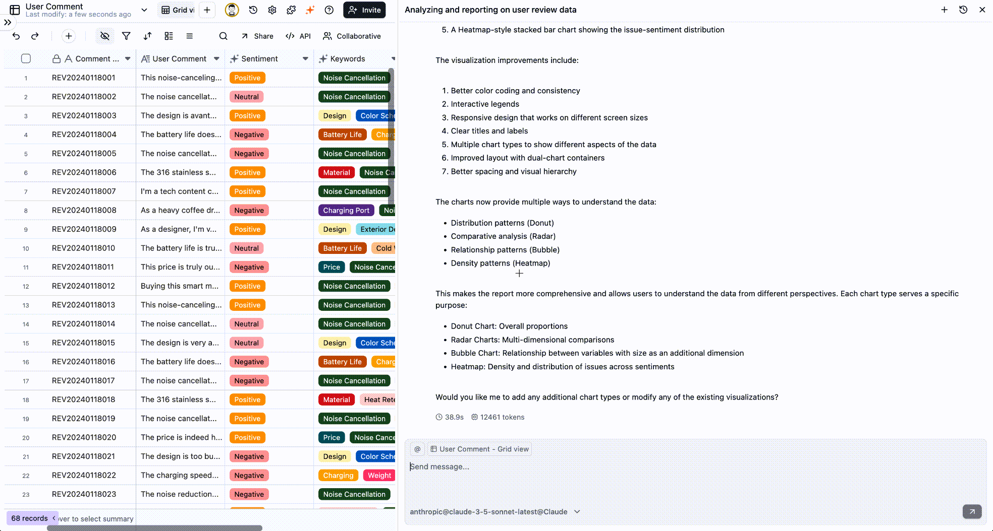
“Generate a heatmap of user activity by day of the week and hour of the day for the last month.”Radar Chart: For Multi-Metric Comparison
Use when you want to compare multiple items across several distinct metrics.Scenario: Comparing competing products or different versions of your own product.Prompt:
“Create a radar chart comparing 'Flagship X' and 'Lite Y' across performance, battery, camera, design, and price.”Scatter Plot: For Correlations
Use when you want to see if a relationship exists between two numerical variables.Scenario: To see if there’s a correlation between marketing spend and sales revenue.Prompt:
“Plot our monthly advertising spend against sales revenue for the past 12 months on a scatter plot.”- A Note on Pie Charts: Pie charts get cluttered with more than five categories. Try a bar chart instead, or ask the AI to “Show the top 5 sources in a pie chart and group the rest as ‘Other’.”
- Radar Charts: For clarity, stick to 3-8 metrics on a radar chart to keep it readable.
Best Practice: A Seamless Flow from Question to Report
Imagine you’re drafting a weekly report. The following conversational flow can help you build a data-backed narrative with compelling visuals:
- Get Core Metrics:
“What were our total revenue and new users last week?” - Break It Down:
“Break down the revenue by product category.” - Visualize It:
“Show that breakdown as a bar chart.” - Investigate the Cause:
“Why is revenue for Product C so low? Check if it has the highest return rate.”
Ultimately, Teable AI is more than a Q&A bot. It’s an extension of your thinking and a catalyst for your decision-making. Now, open the conversation and ask your first business question.